Sharing Filipino Cuisine With The World
About Nonie's
Founded by Patrick and Shria Florencio, a Filipino couple who met in Singapore, Nonie's is more than a restaurant. It’s an experience fuelled by combined diverse backgrounds, travel adventures and a love of food.
With a focus on good, natural meals, one step through the Nonie's door has you feeling as though you've walked into your grandparent's house. Why? Their menu is packed with food from the heart that fuels the mind, body and soul.
Beyond this, with a love for the world and the unique natural diversity of Boracay, Patrick and Shria wanted to do their part for the planet. Over the past eight years, they have run their business successfully, sourcing ingredients only from the local community and farmers.
With this mantra and fantastic menu, Nonie's has grown from a small restaurant into the go-to destination in Boracay for delectable, sustainable food.
The design process
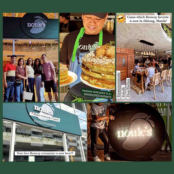
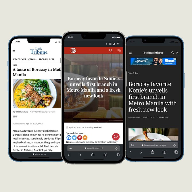
Shira and Patrick reached out to Harbrow Creations as they wanted a fresh look for their branding. With their Boracay store making waves in the community, they were ready to take their footprint to new levels by opening a store in Manila.
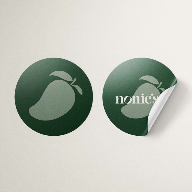
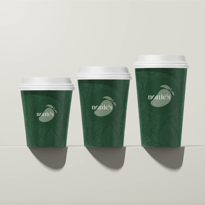
Upon chatting with the Nonie's team, we quickly learned that the Mango on their existing logo was the most iconic part of the brand. With this in mind, we made it our mission to centre the design around the famous mango, but to make tweaks to freshen up the look.
When it entered the Manila market, we wanted the brand to feel experienced, but young, making it exciting among youths and millennials so it instantly became the next ‘in’ place to eat.
With the market in Manila being heavily competitive, it was also critical that we created a design that could stand out from the crowd while still staying true to Nonie’s mission and vision. For this reason, we put fresh, local, sustainable and healthy eating all at the front of mind when creating this new design.
The Result
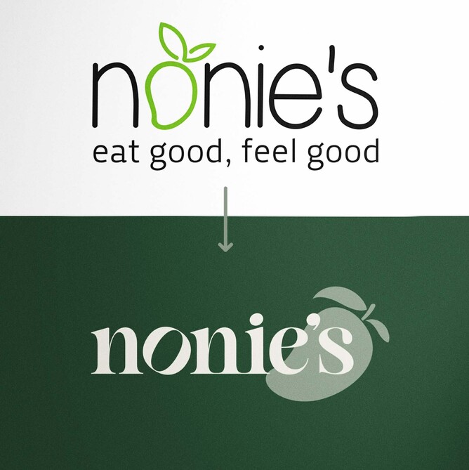
The green palette in the existing branding spoke of freshness and natural flavours to us, but it felt young and inexperienced. To enter the Manila market as a quality, premium brand, we changed the existing lime green to a darker, richer shade of green. This slight change let us keep the brand in tune with its roots but redefine it as a luxe destination for must-try food.
Honing the importance of the mango, we went above and beyond to ensure this tropical fruit remained a key hero of the logo. We kept it front and centre, but instead of making it part of the typography, we created a light green highlighted silhouette of a mango, used in the background of the design. This kept the luxury and exclusive theme we were seeking but allowed us to stay true to Nonie’s roots, helping customers recognise the brand, even hours from Boracay.
When it came to typography, sophistication was our focus. Electing a modern, minimalist font created a grand experience long before people entered the restaurant. It matched the new interior design perfectly and worked to lure customers in with the promise of contemporary eating unlike any other.
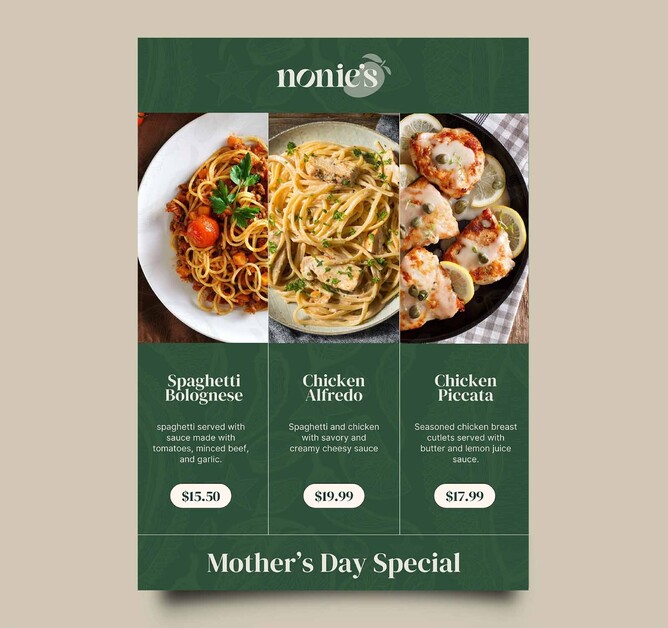
To assist with conveying that this modern restaurant still stays true to its love for using natural ingredients, we also created some hand-drawn elements that featured durian, chilis and everything in between. These backgrounds can be used on letterheads, business cards, takeaway packaging, uniforms, menus, social media and so much more. They will serve as a great way to connect the modern, contemporary elements of the new design with the commitment to local, sustainable food, ingredients and cooking that Nonie's stands for.
What did the customer think?
“We had the pleasure of collaborating with Amanda from Harbrow Creations, who played an integral role in elevating our Filipino-inspired brand, Nonie’s, to new heights. Working with Amanda was an absolute delight from start to finish.
She effortlessly captured the essence of Nonie’s, infusing our brand with vibrancy, authenticity, and a touch of modernity. Her keen eye for detail and innate understanding of our vision allowed her to craft a brand identity that hit the mark!
Not only is Amanda exceptionally talented, but she is also a joy to work with. Her positive energy and collaborative spirit made the entire process seamless and enjoyable. She listened attentively to our ideas, offered valuable insights, and brought them to life with finesse.
What sets Amanda apart is her ability to think outside the box. She brought fresh perspectives to the table, pushing boundaries and challenging conventions in the most inspiring way possible.
We couldn't be happier with the result. Her creativity, professionalism, and dedication to her craft are unmatched. Working with her was not only a pleasure but also an invaluable learning experience. I would wholeheartedly recommend Amanda to anyone seeking to elevate their brand to new heights. Thank you, Amanda, for your exceptional work and unwavering dedication to making Nonies shine!”
Thank you, Shira and Patrick, for this amazing opportunity to work with you on this fun re-branding project!